Keith Titaniumis a company developing and selling titanium tableware, kitchenware, andrelated products, founded 15 years ago in Guangdong, China.Originally builtaround OEM manufacturing for U.S. brands, leveraging its manufacturing andprocessing expertise, the company began selling its own products in Westernmarkets 12 years ago. In recent years, it has shifted toward design-drivenproduct development aimed at Western consumers.
Ahead of itsglobal expansion, we led the development and production of a new CI at the coreof strengthening Keith Titanium's brand equity — encompassing a redesigned logobuilt to function as a truly "global brand" across future mediatouchpoints including dimensional signage, a global website, and productpackaging design, along with a comprehensive brand guideline to maintain brandconsistency across all of these.
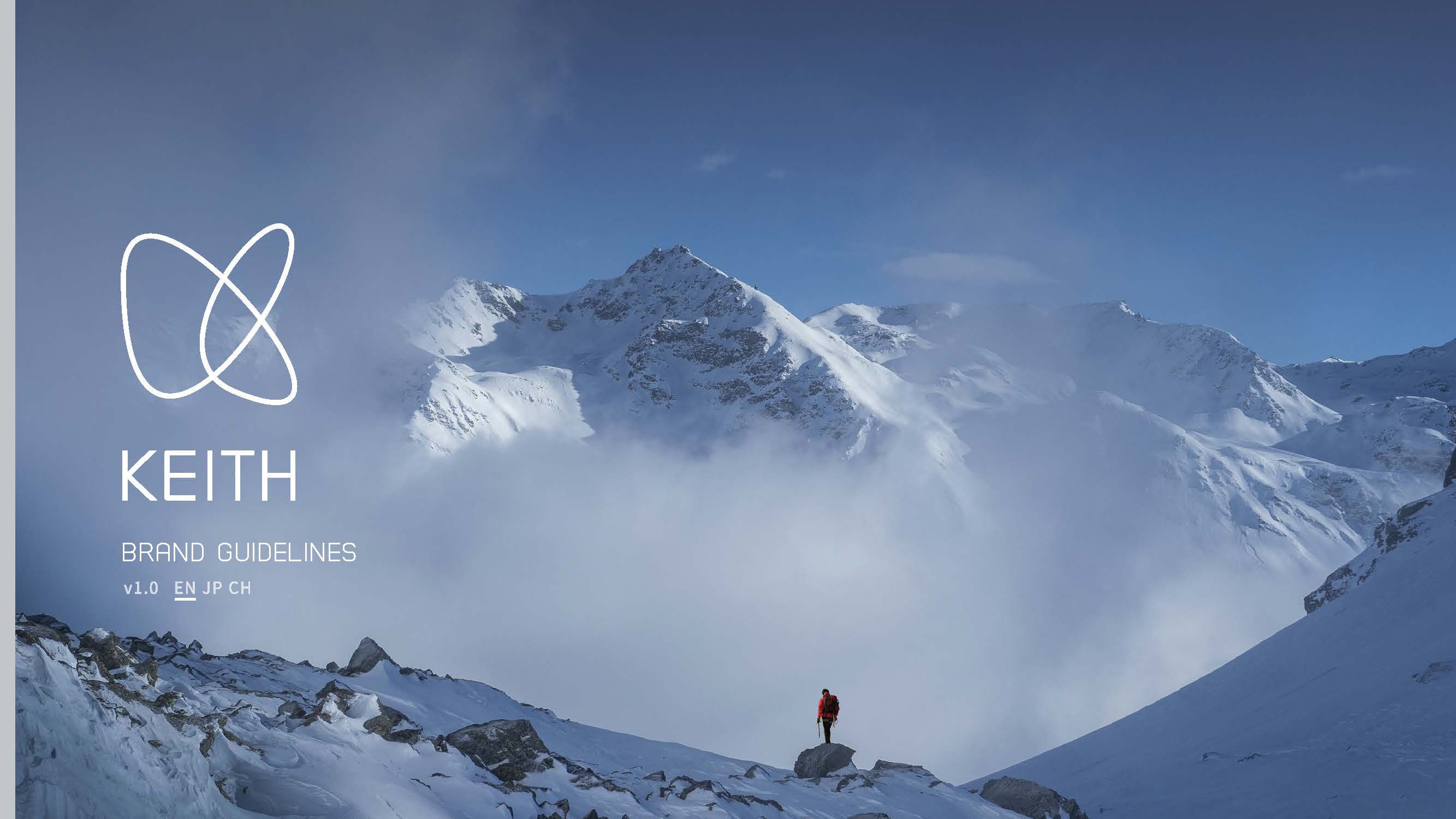
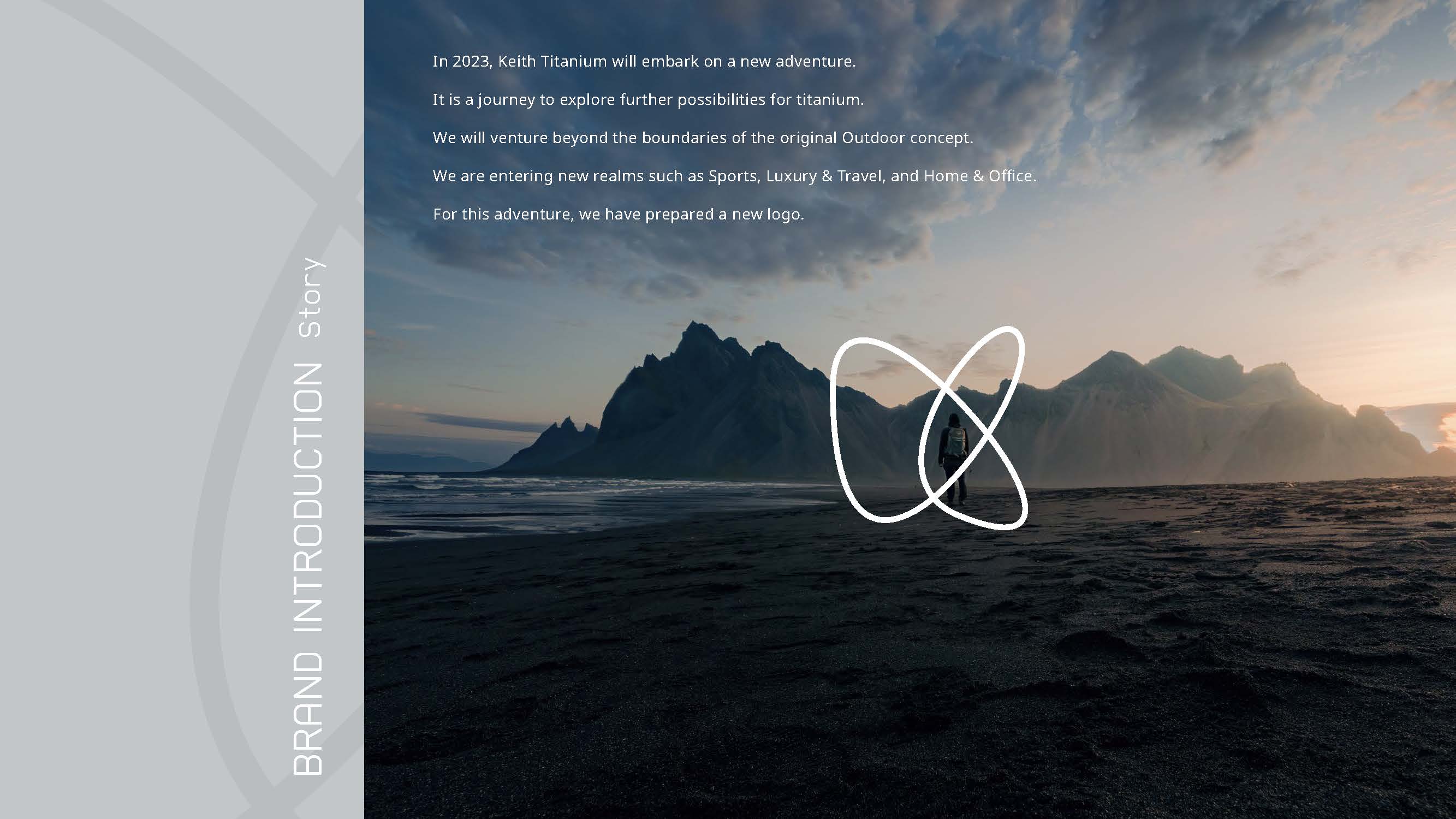
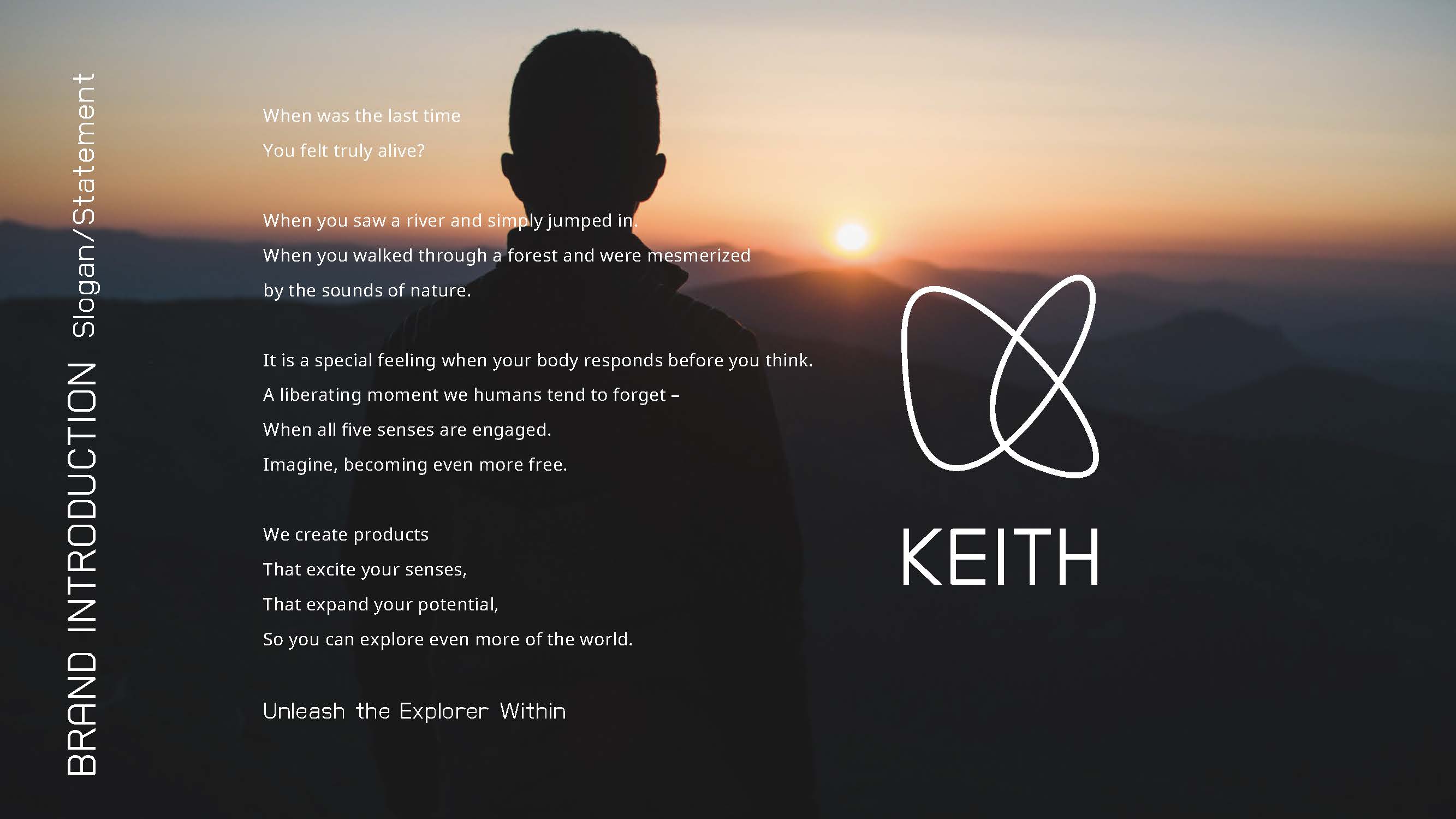
We crafted the brand statement "Unleash the Explorer Within" to embodythe brand's worldview — expressing, in poetic language, the core product valueof unlocking human senses and expanding human mobility.
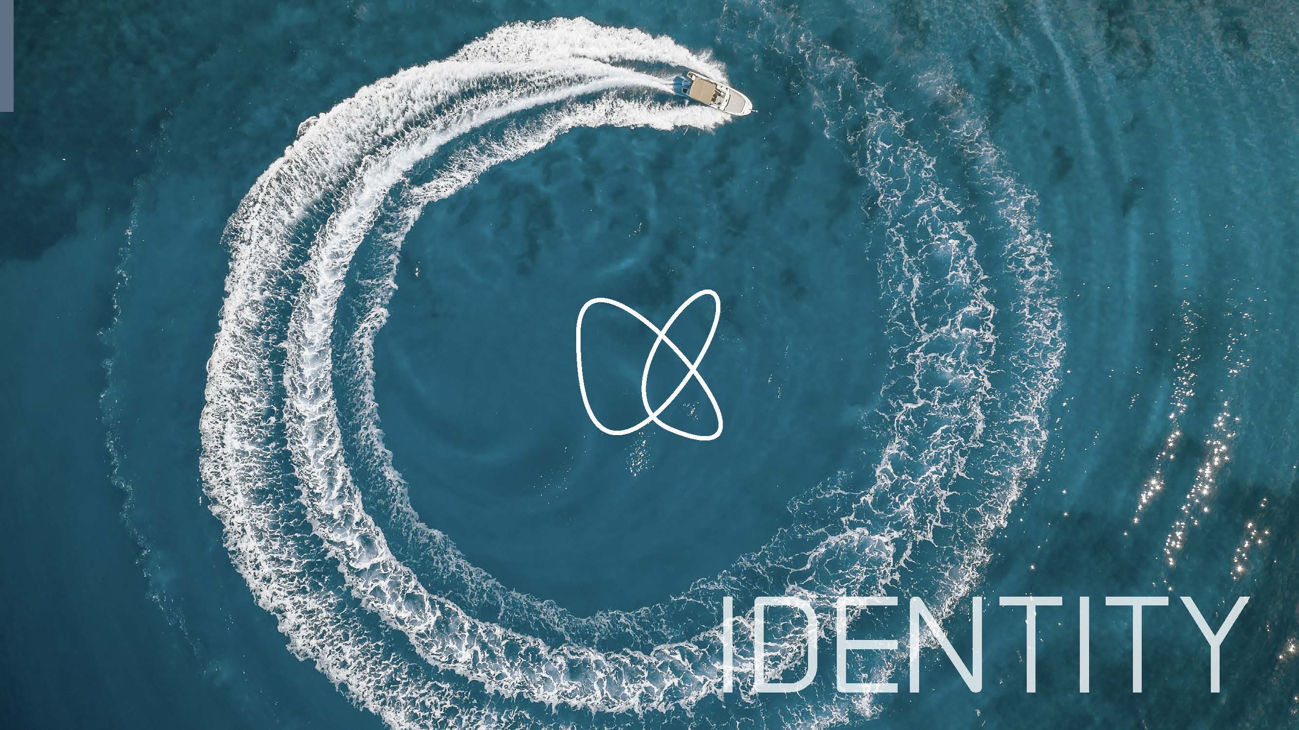
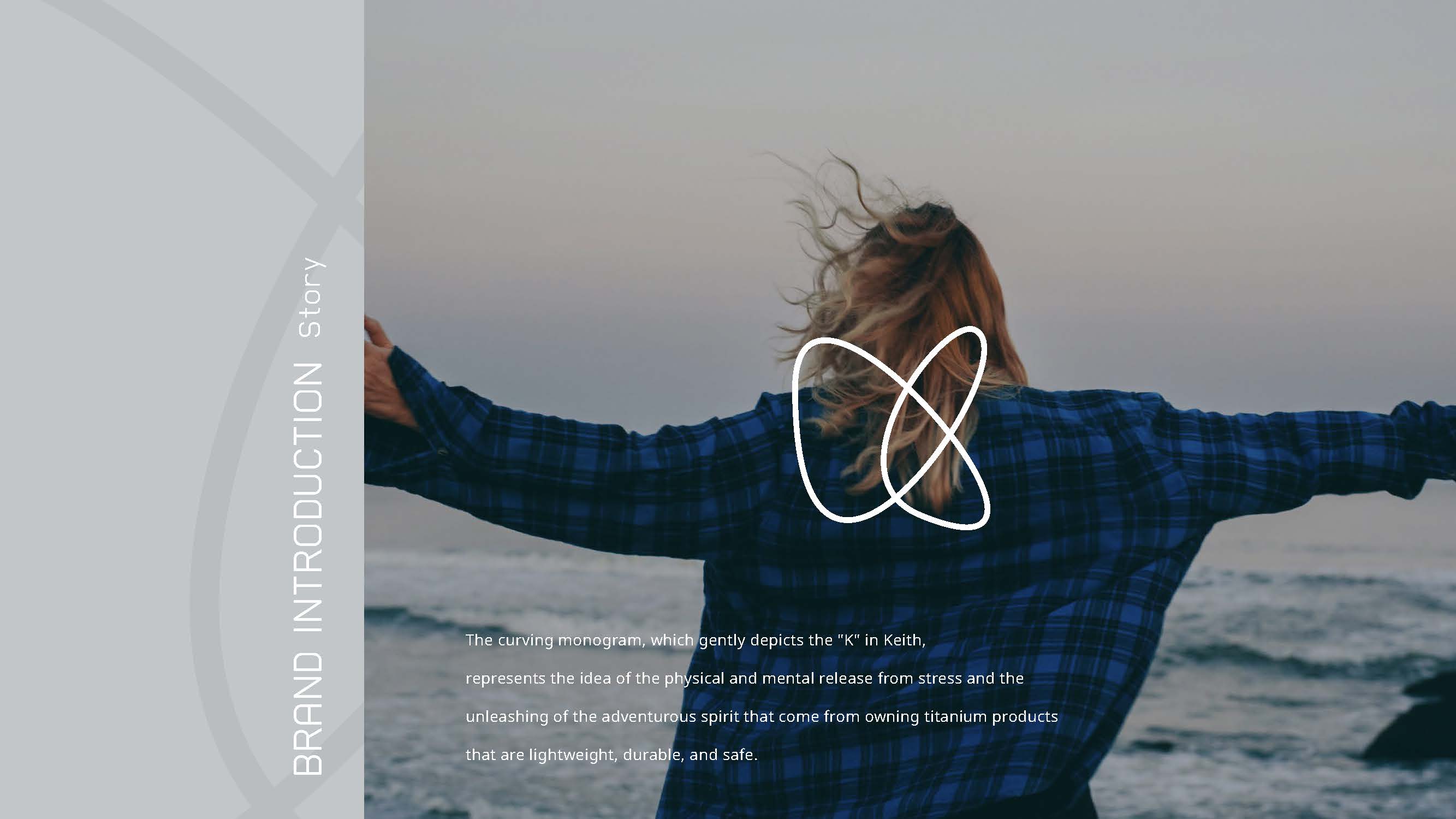
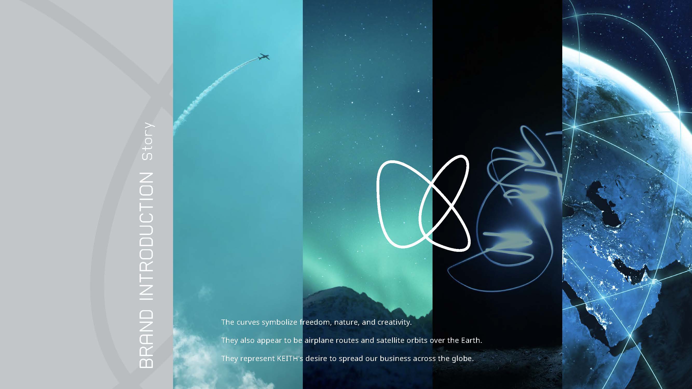
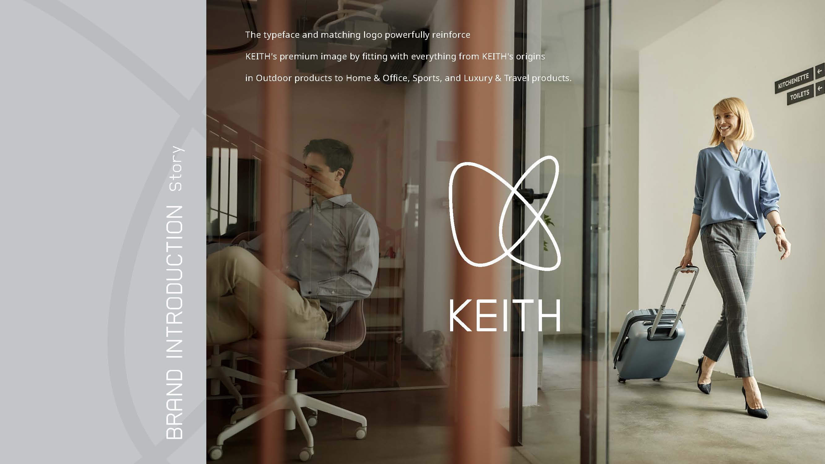
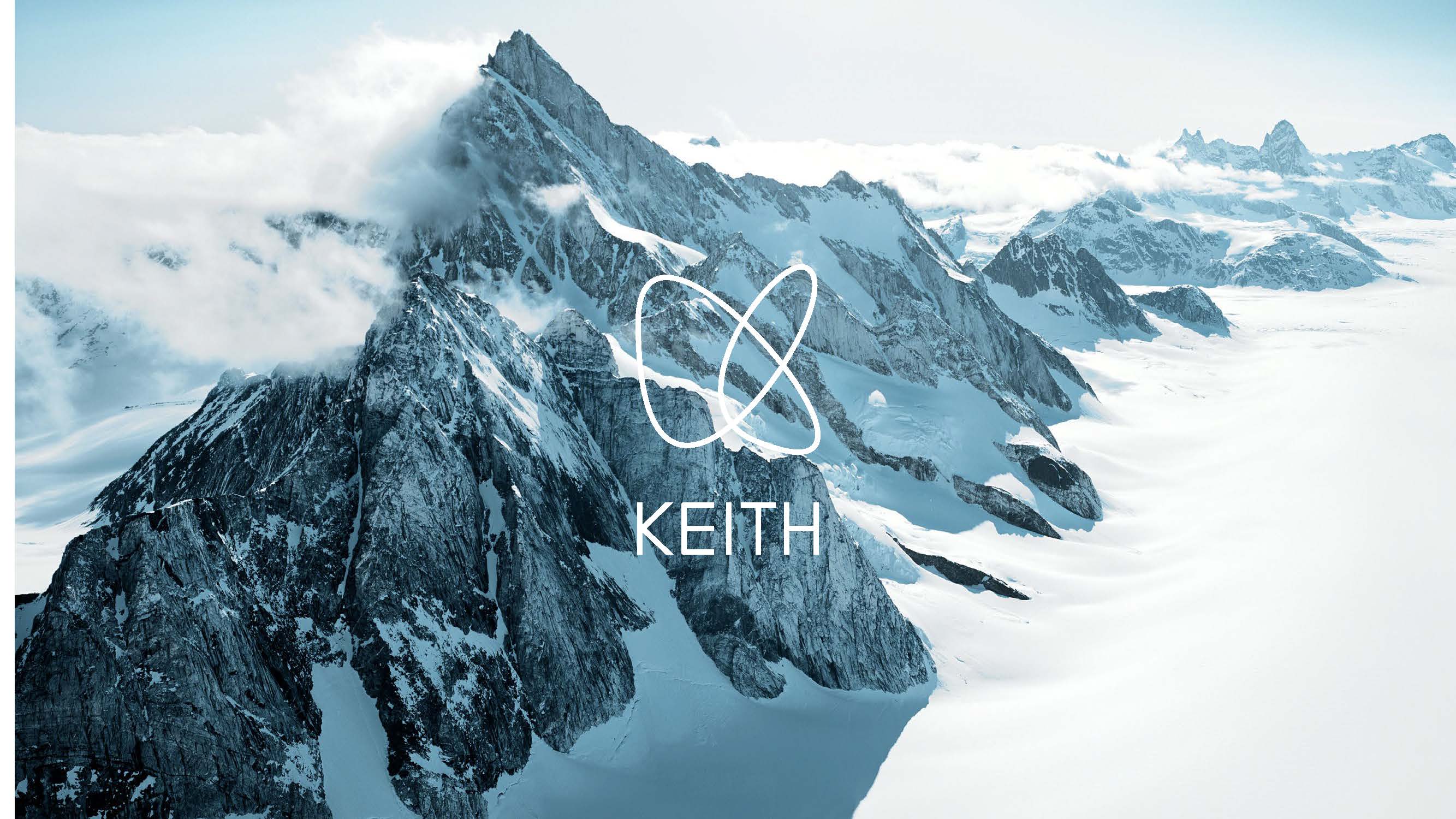
The new logomark is a monogram formed by a gently curved rendering of the"K" in KEITH. It expresses a sense of physical and mental liberationgained through owning titanium products that are "light, durable, andsafe" — as well as an unleashed spirit of adventure. At the same time, thecurve symbolizes freedom, nature, and creativity, evoking the orbit of aircraftand satellites circling the earth, embodying the aspiration for KEITH'sbusiness to expand across the globe. Designed to work seamlessly across thebrand's full product range — from its Outdoor origins to Home & Office,Sport, and Luxury & Travel — the mark reinforces KEITH's premium brandimage.
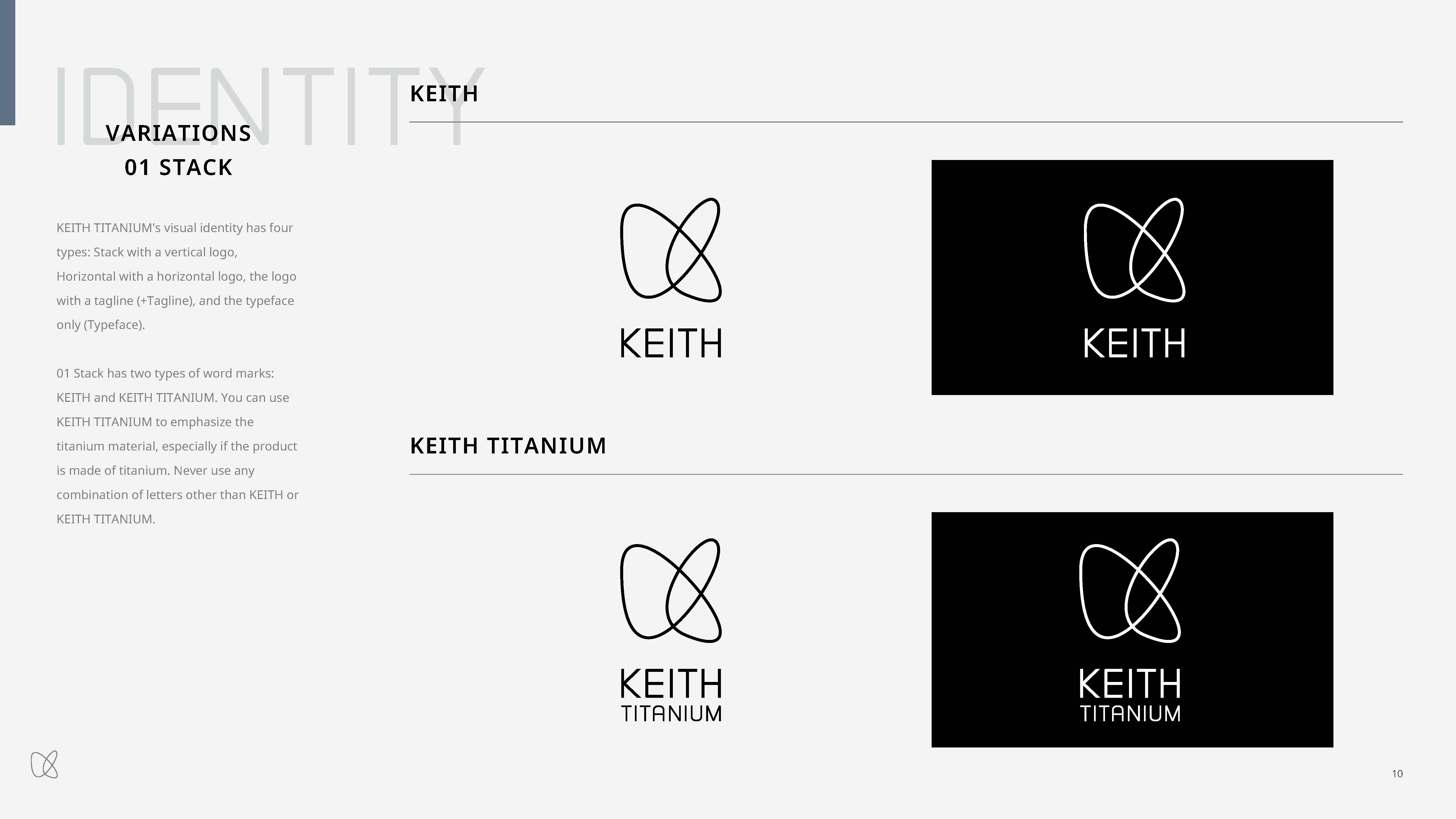
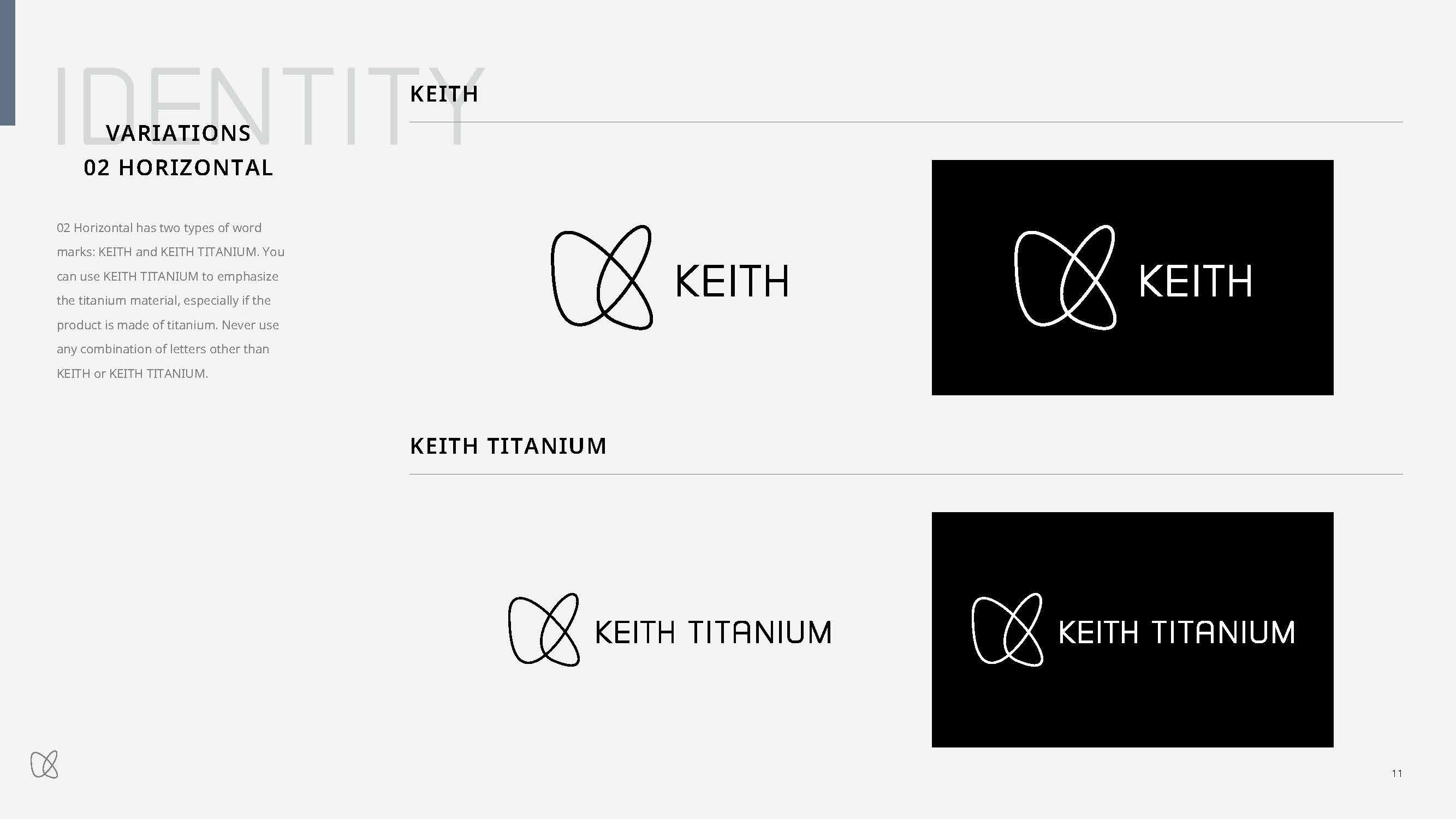
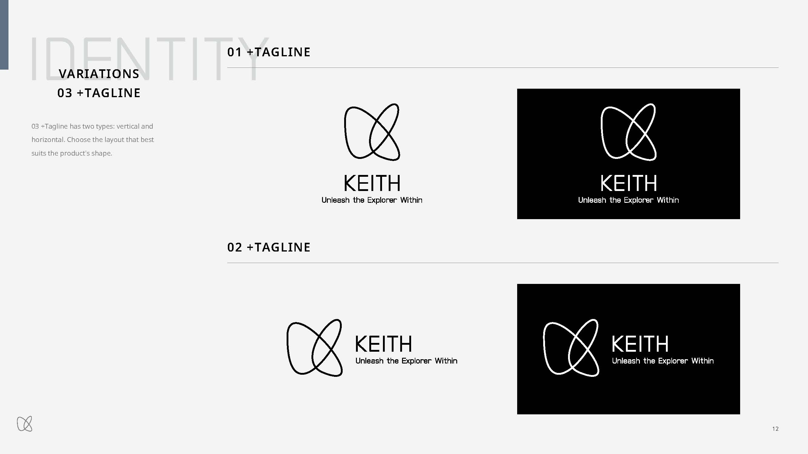

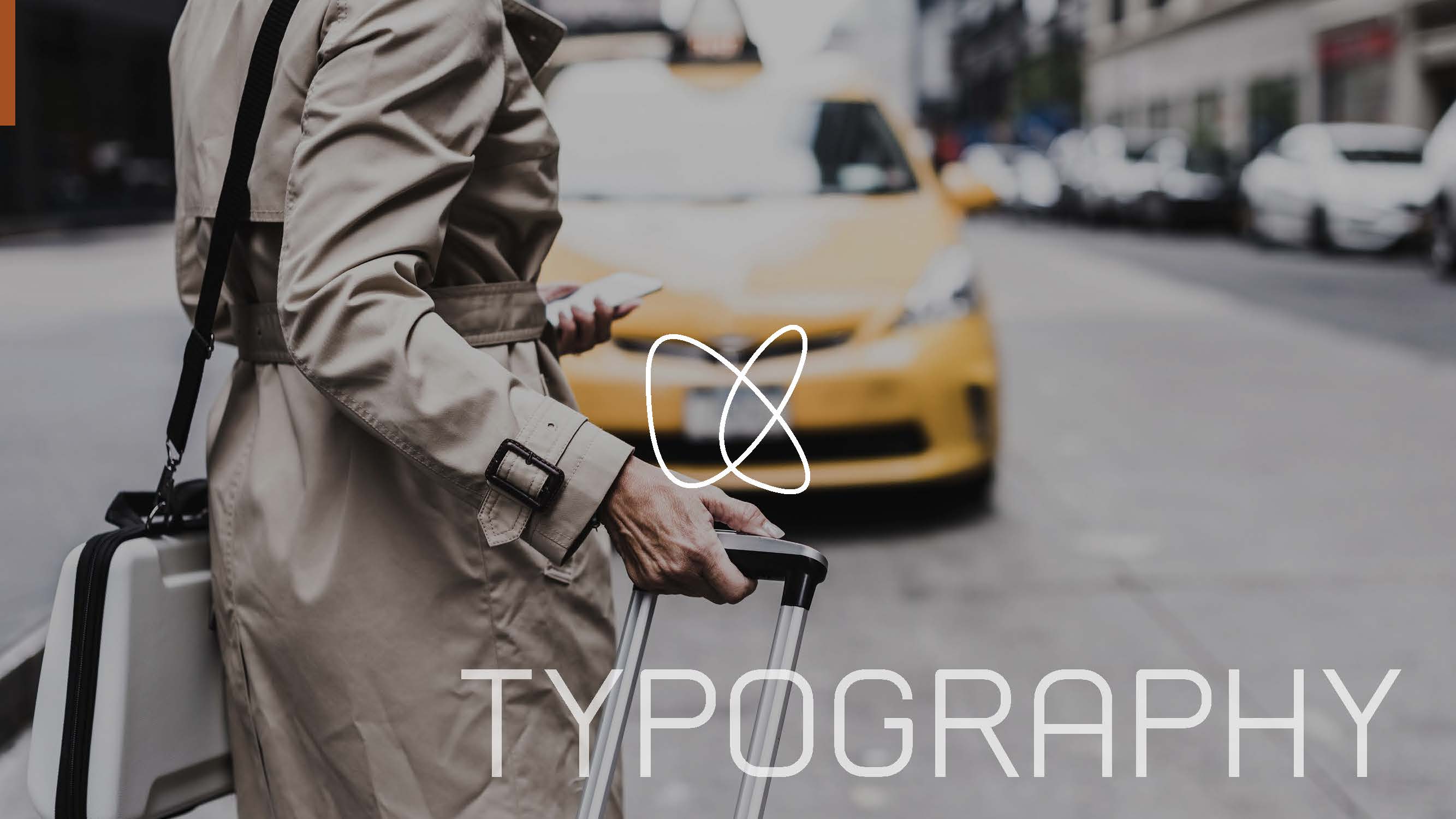
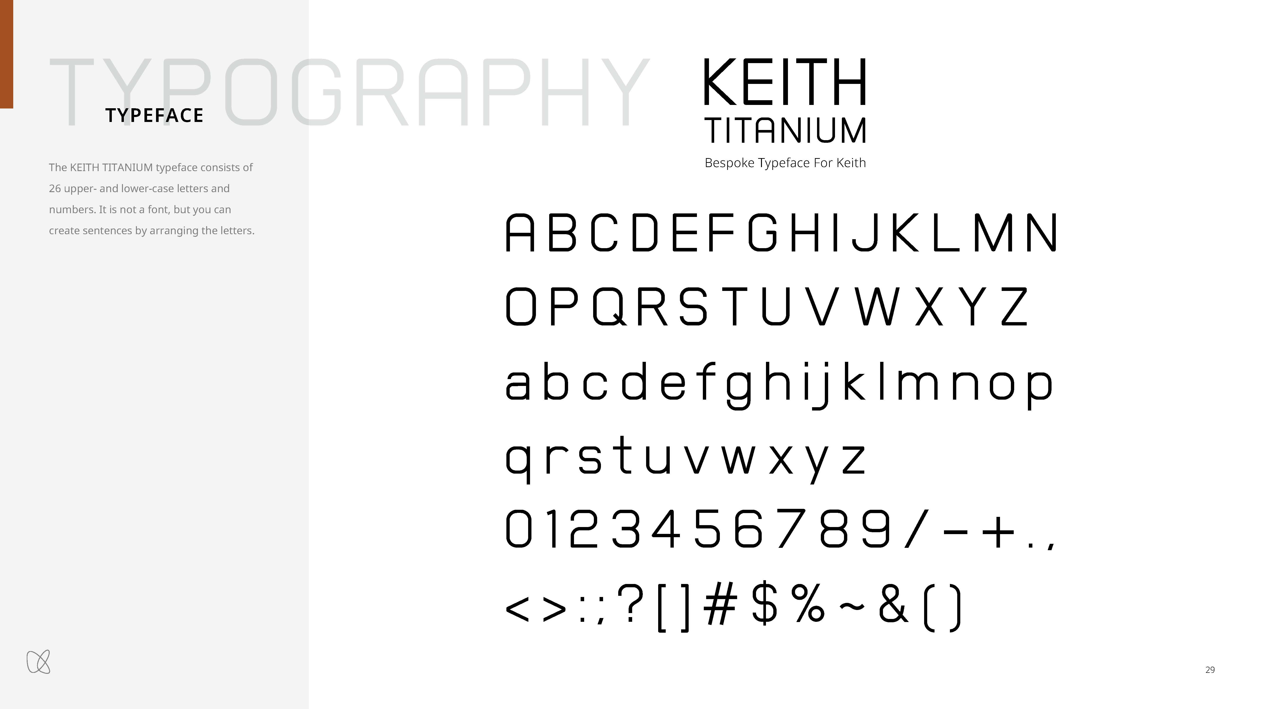
To further strengthen the KEITH TITANIUM brand identity, we developed a bespokebrand typeface concept around the "thin, strong, and smooth" tactilequalities of titanium products. Comprising the full alphabet, numerals, andsymbols, the typeface brings consistency to the logotype and key brandmessaging.
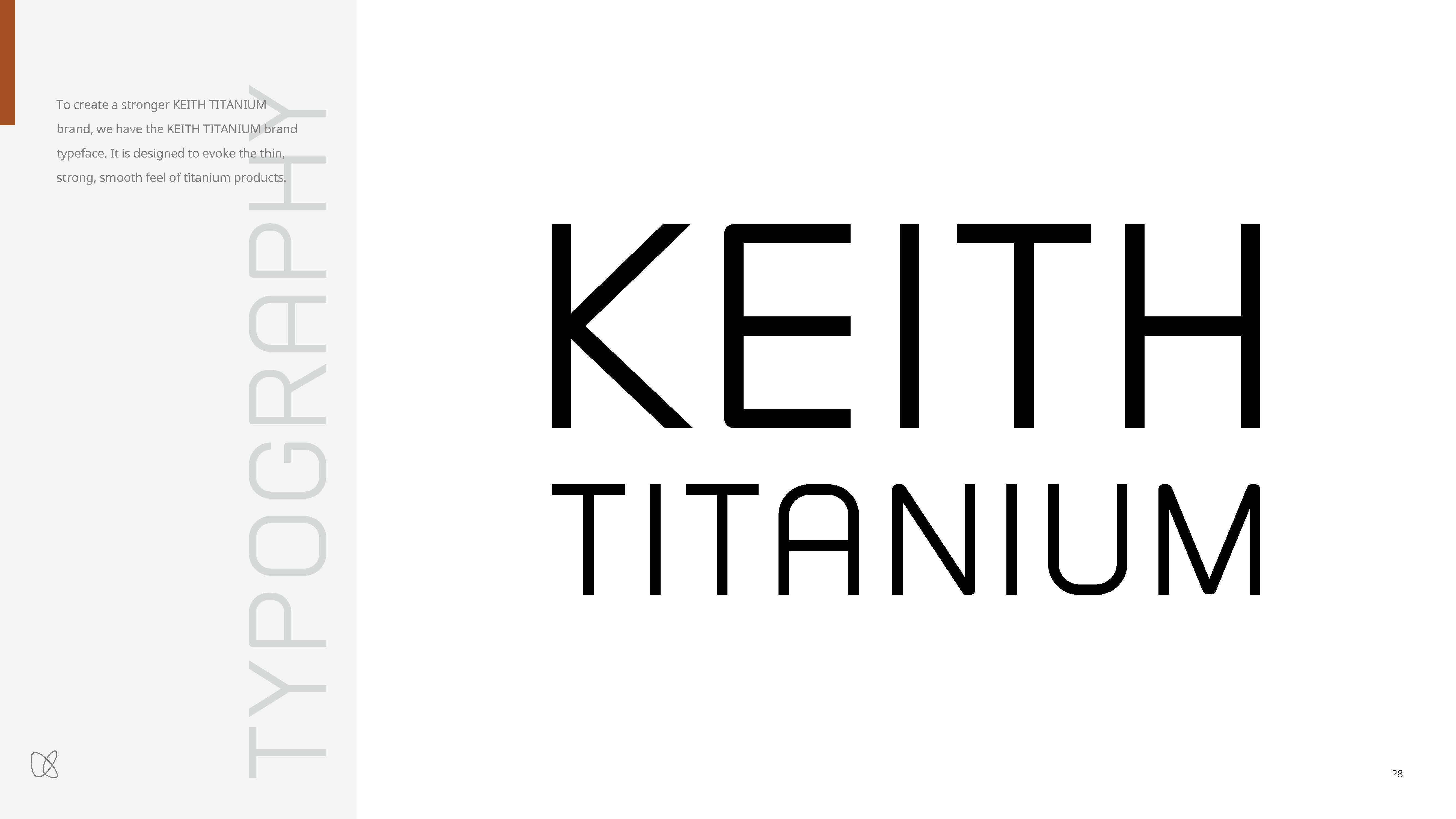
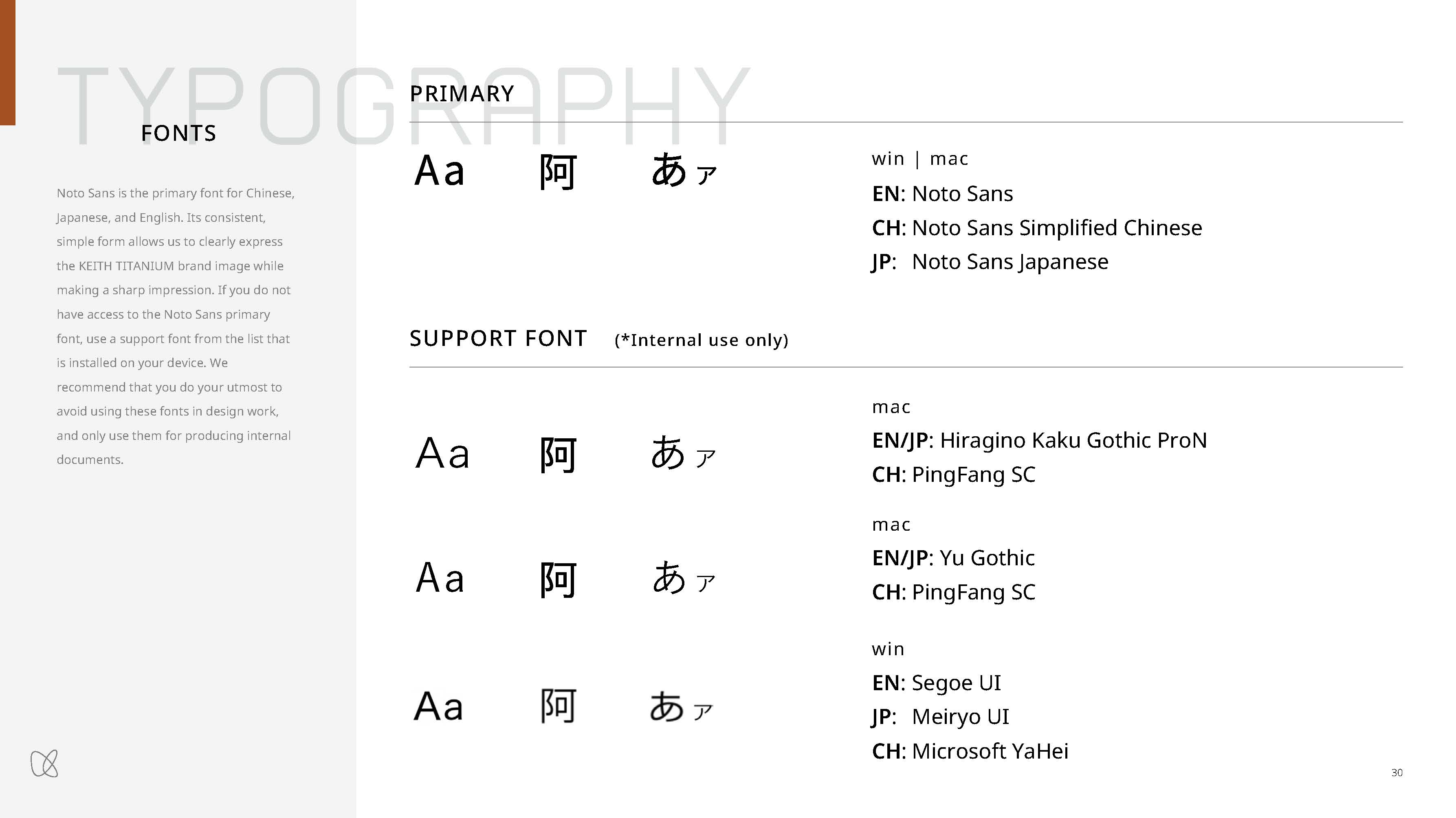
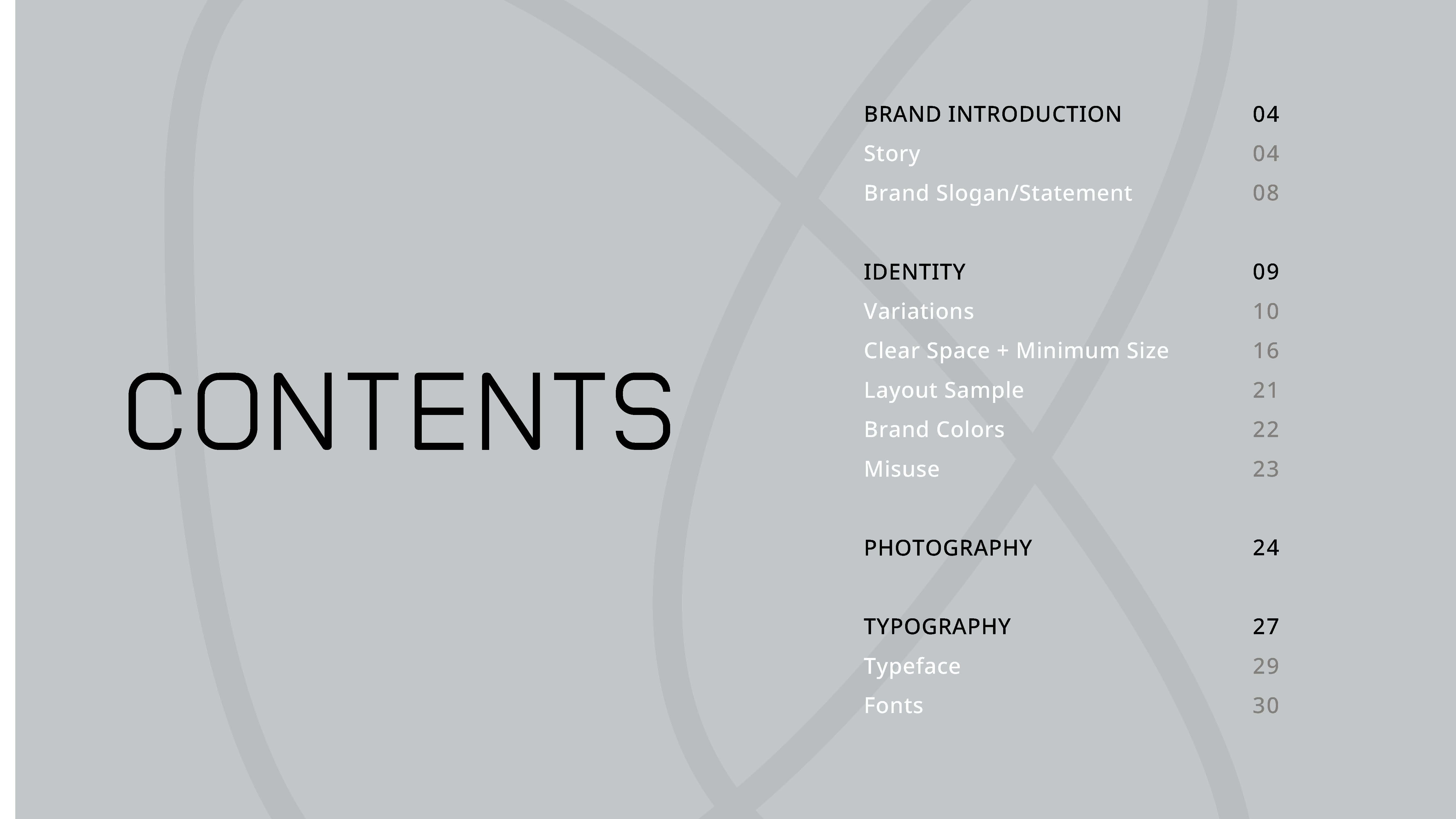
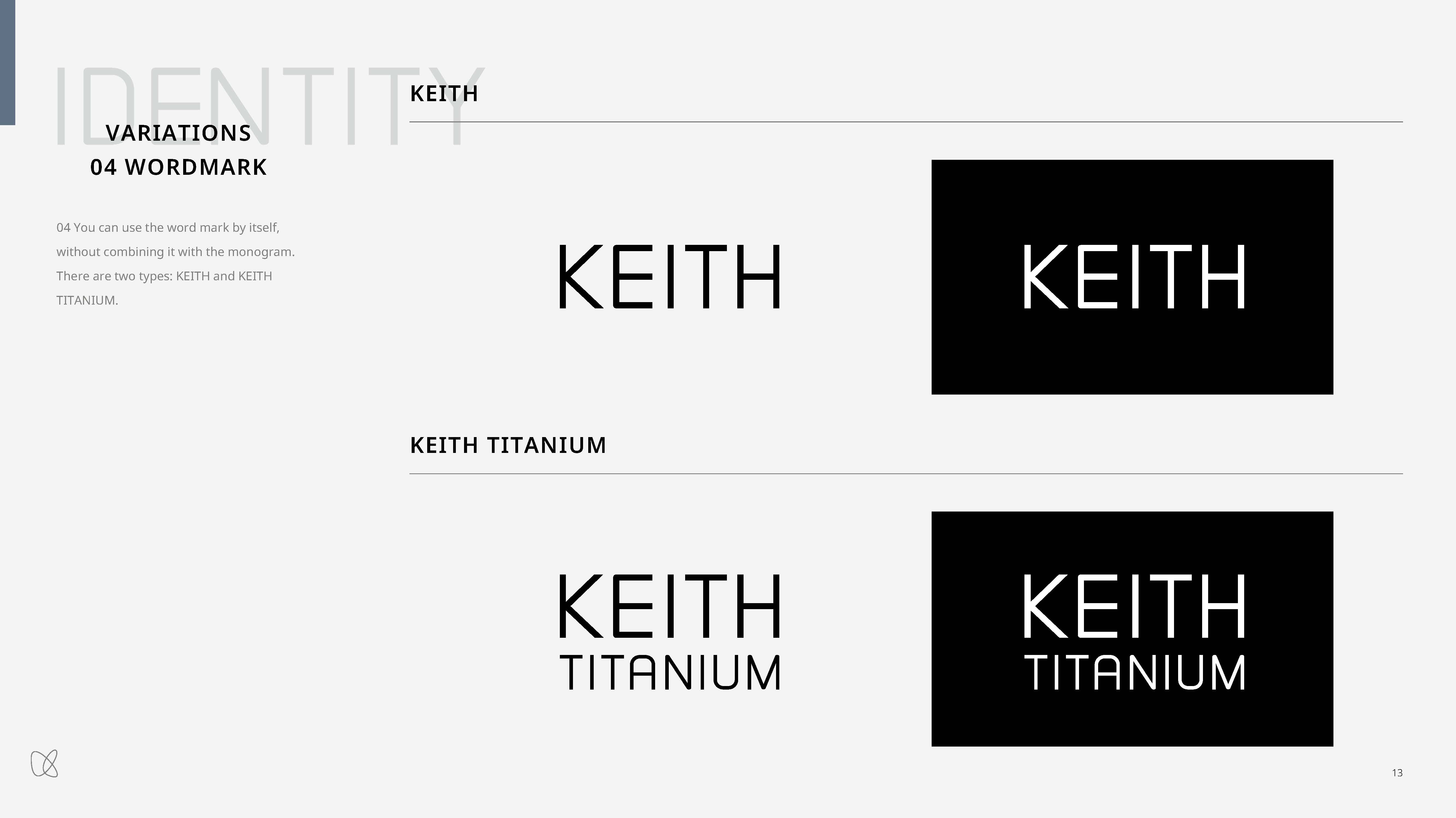
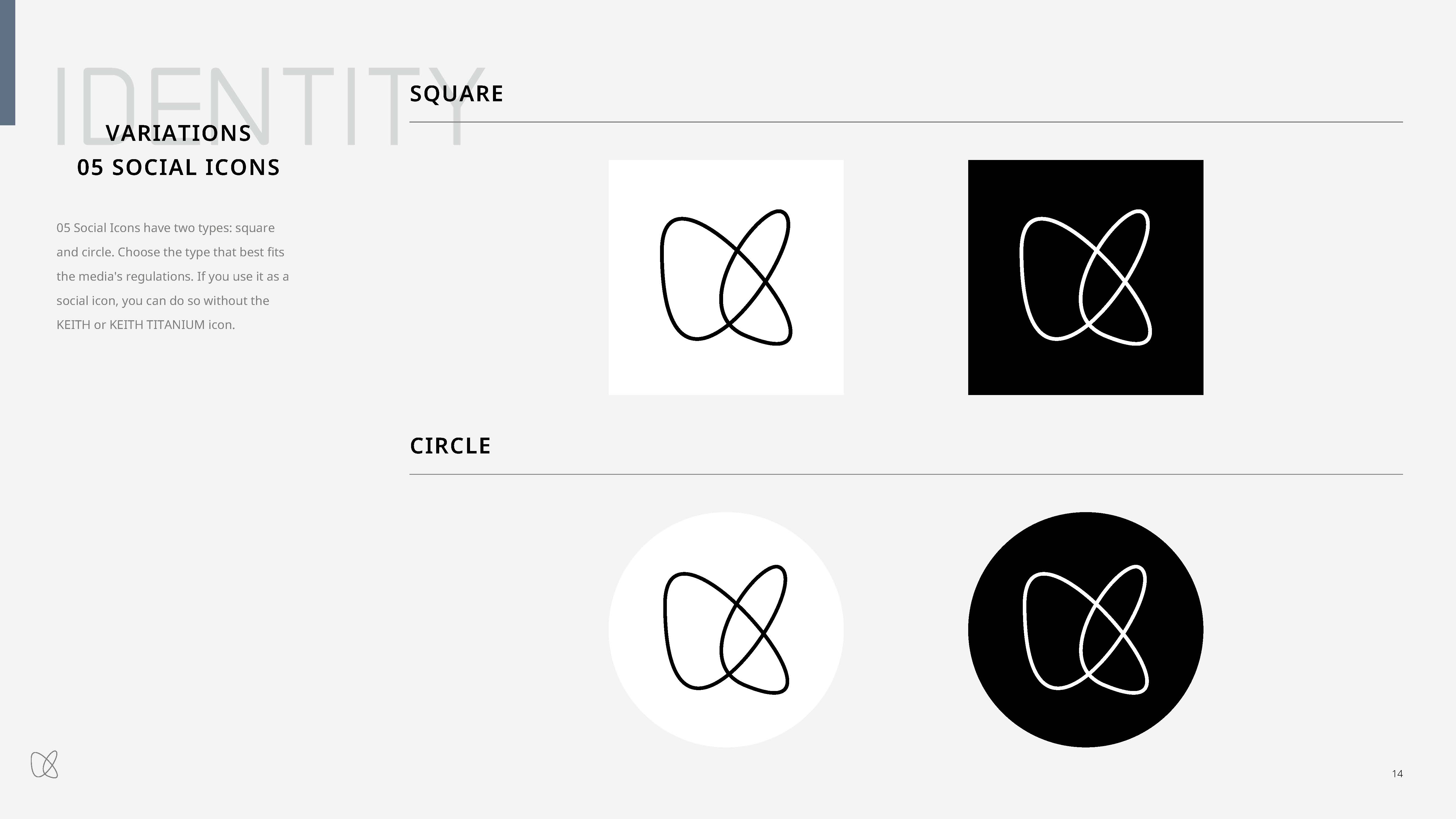
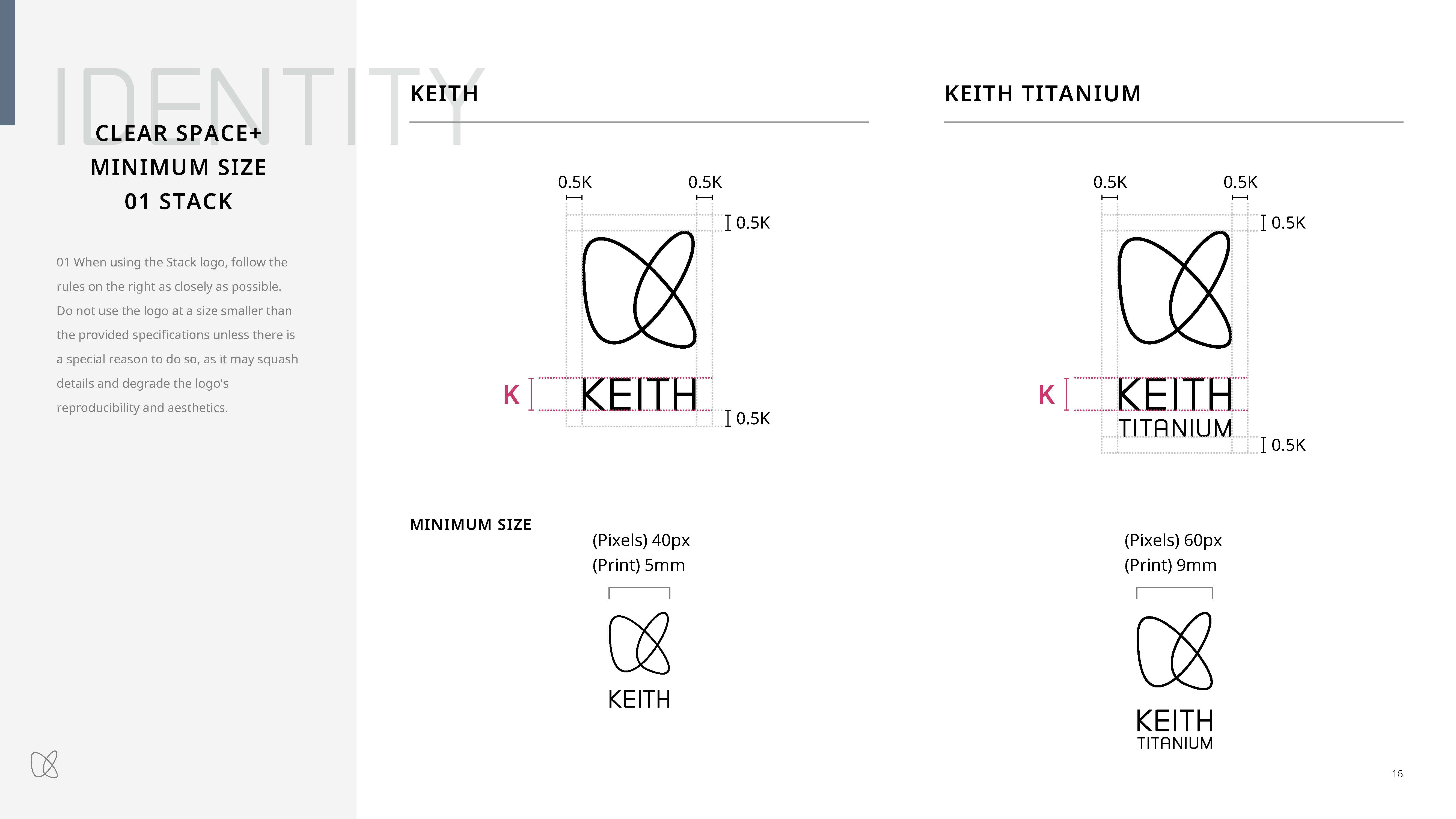
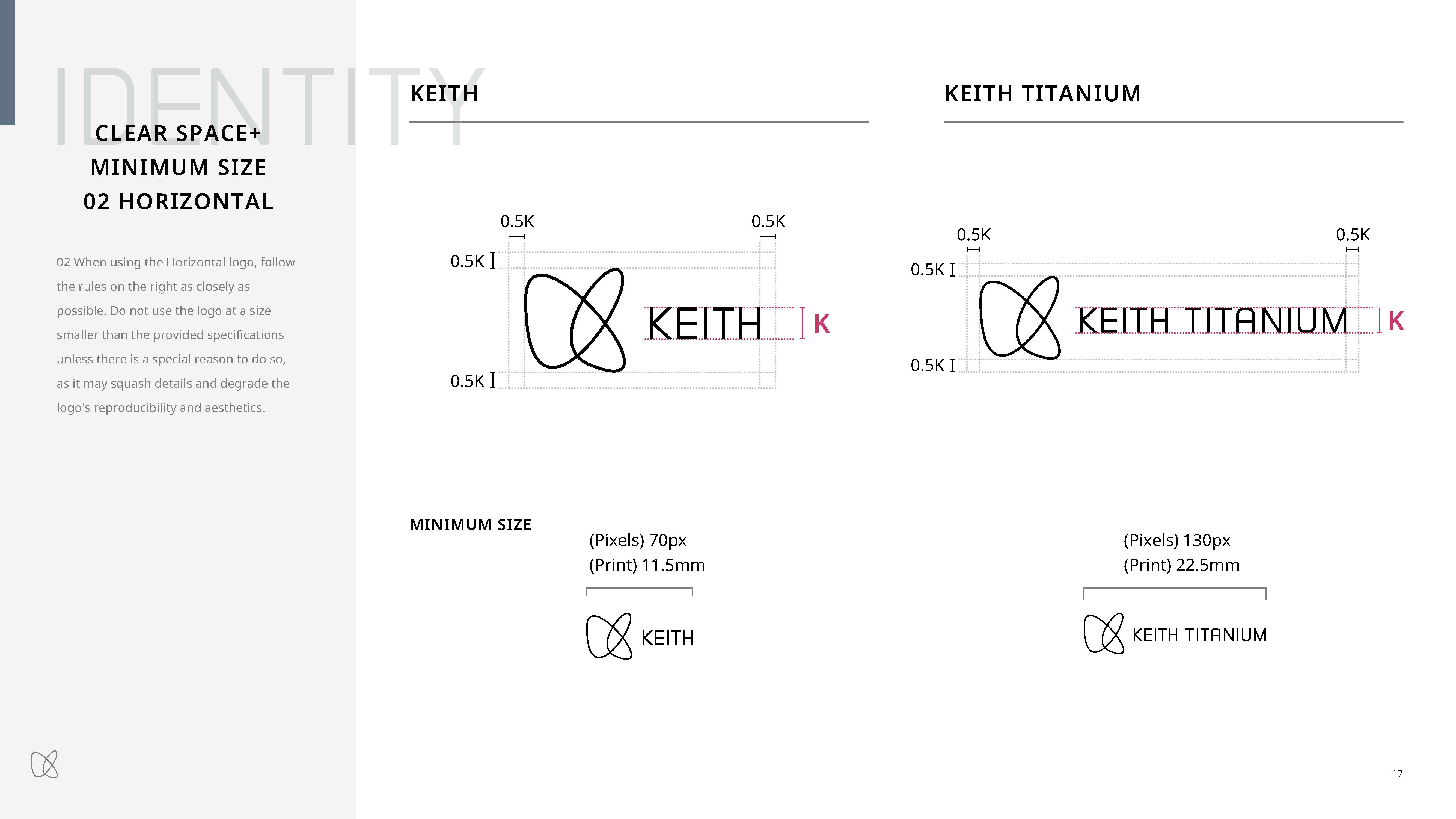
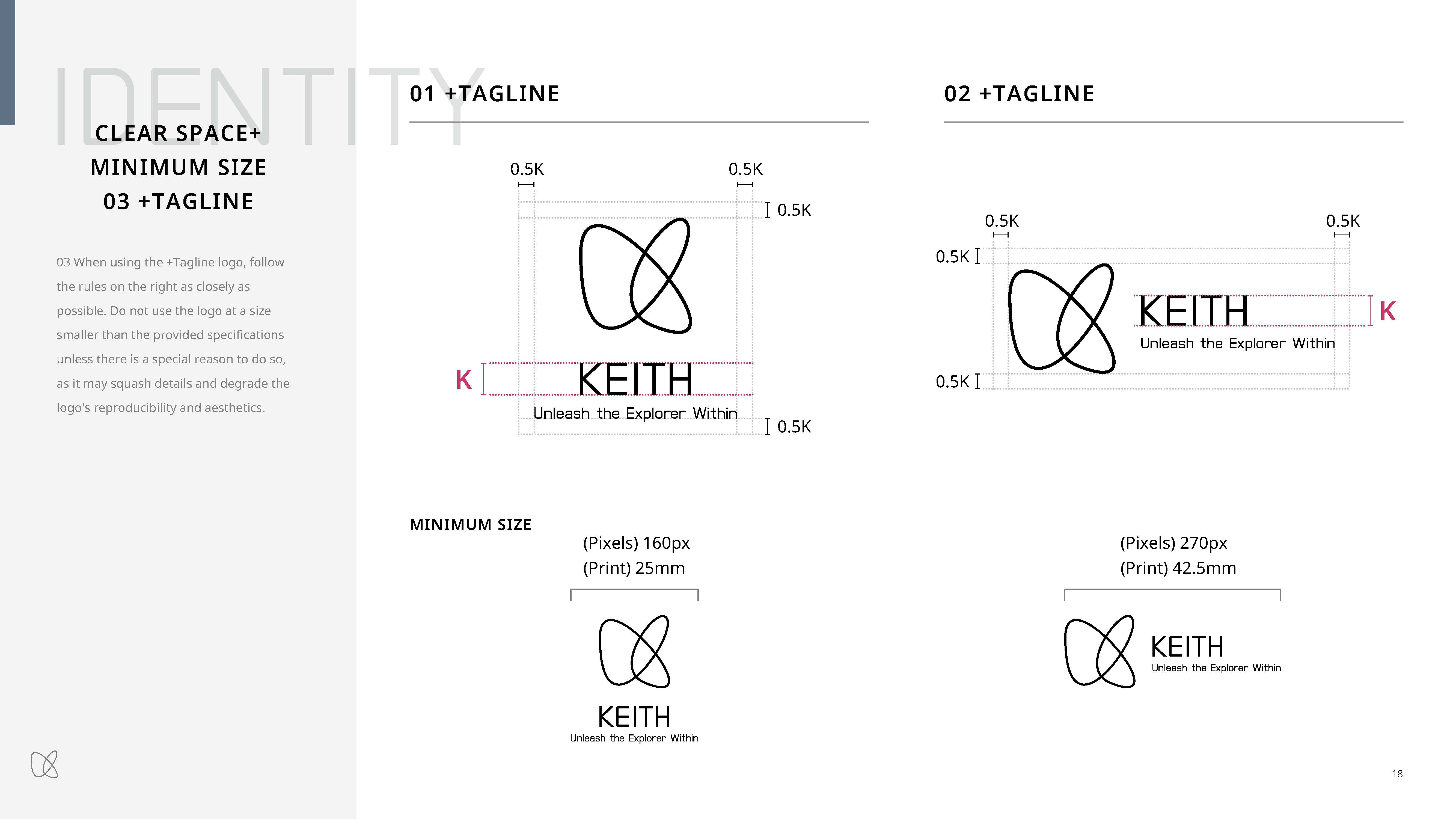
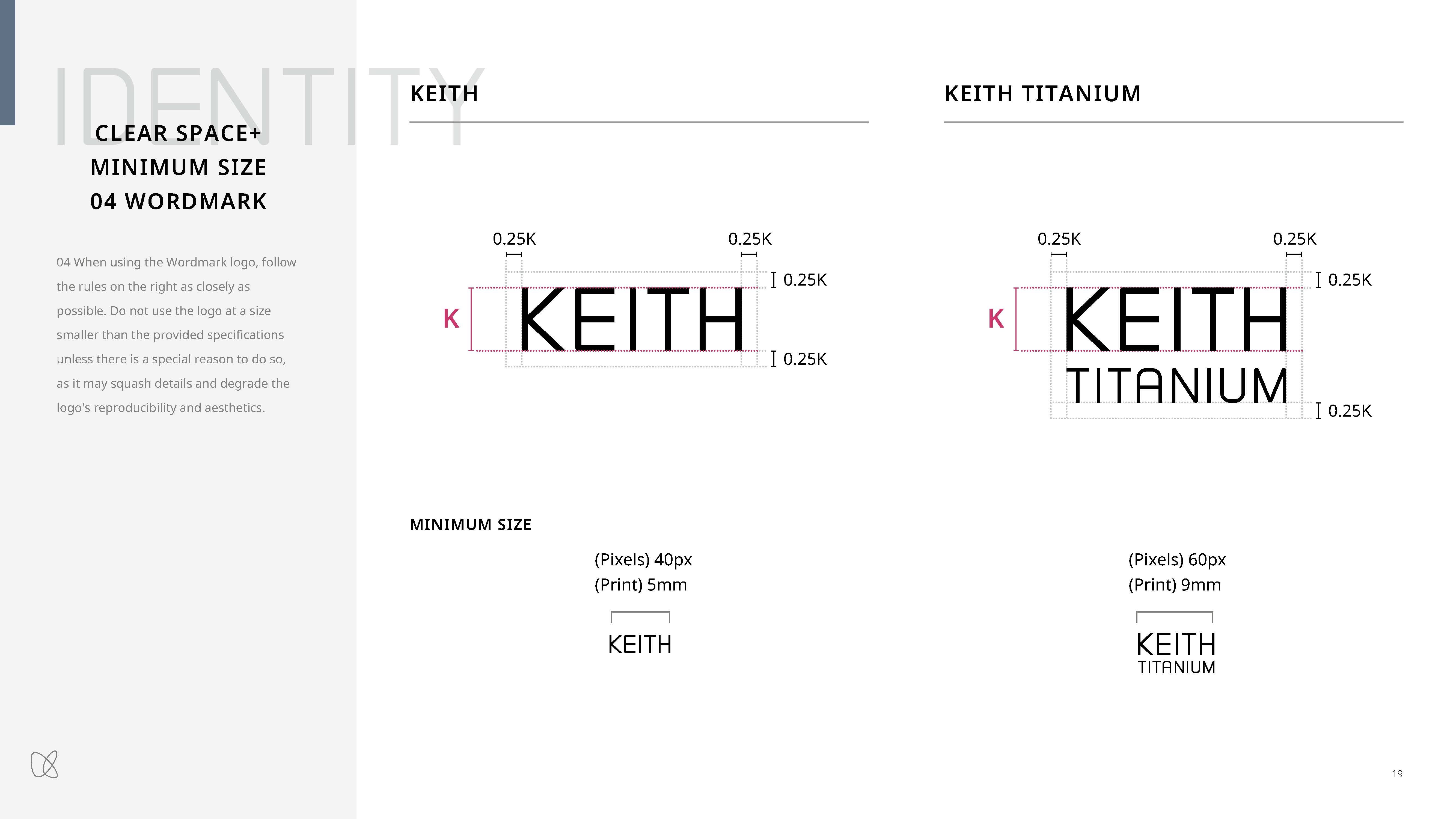
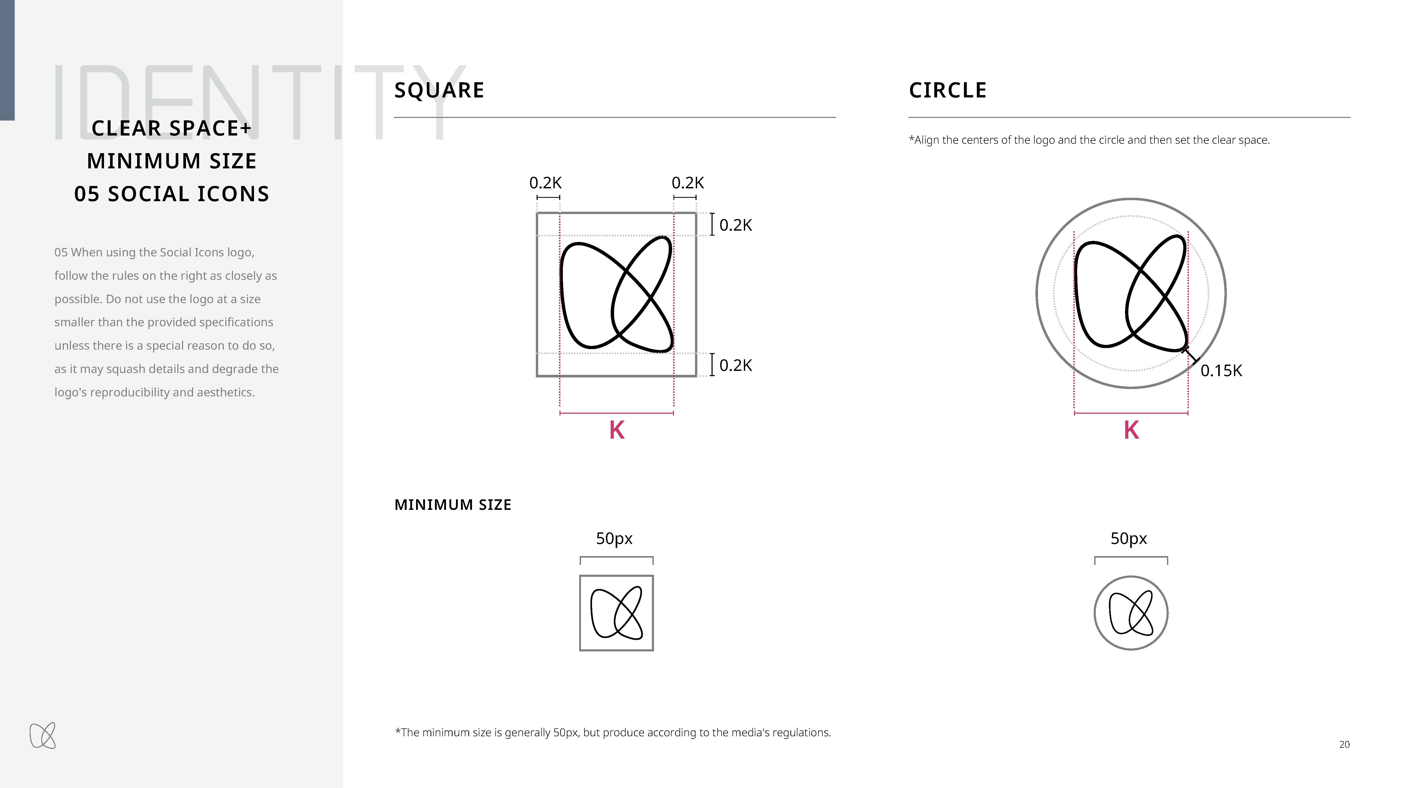
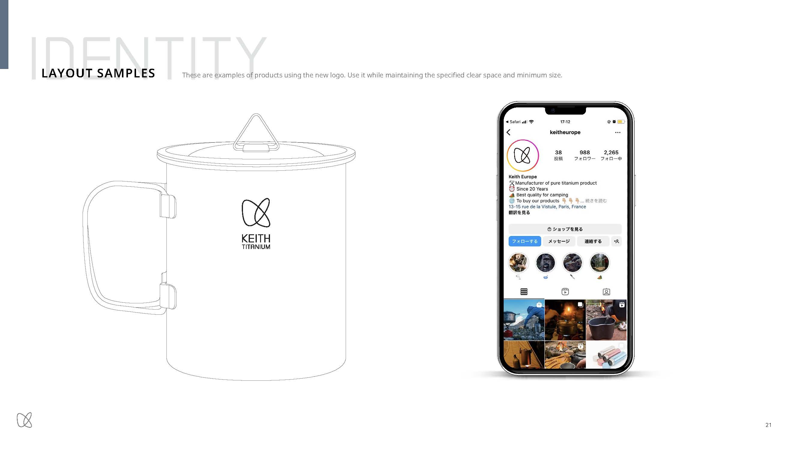
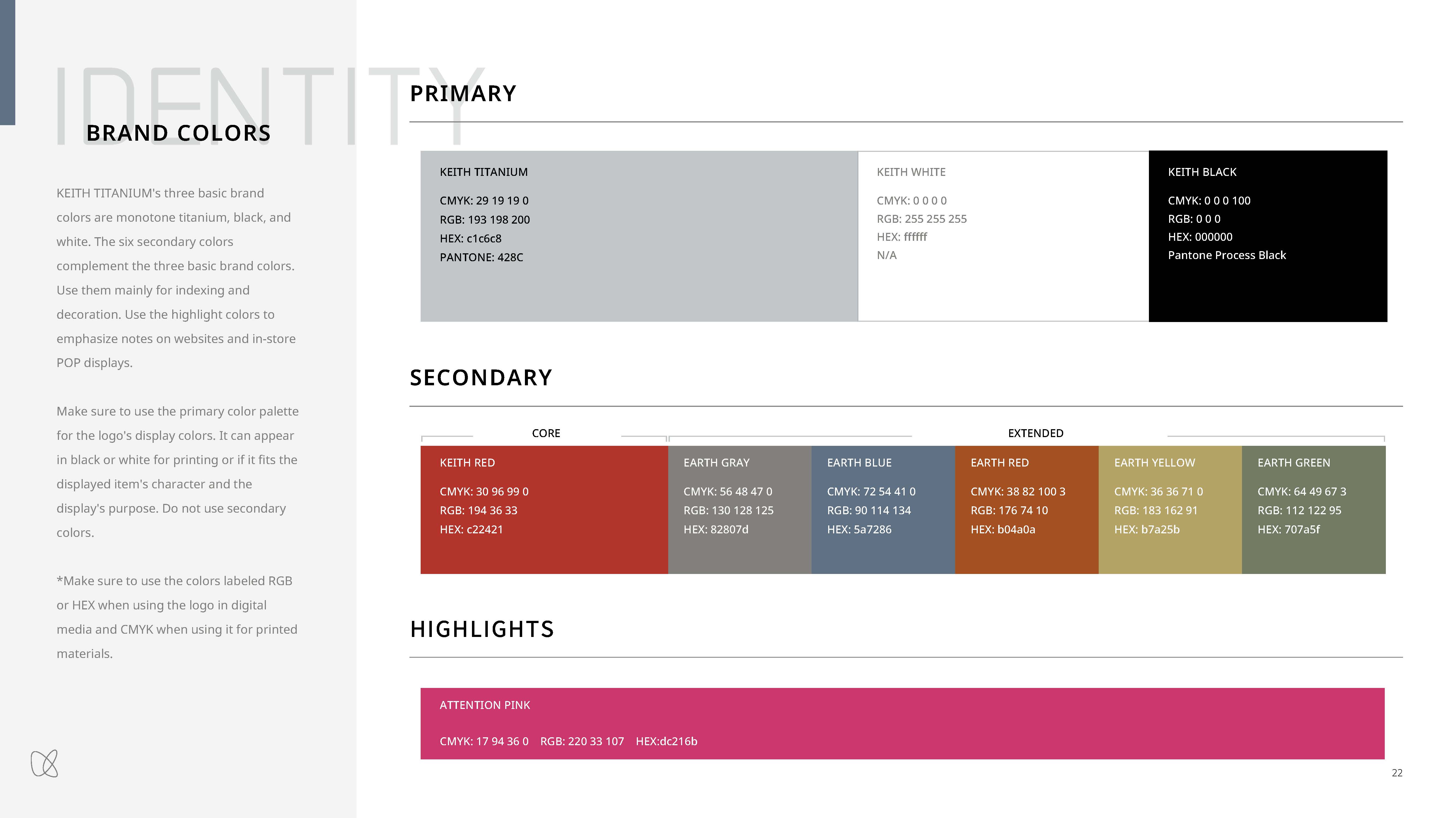
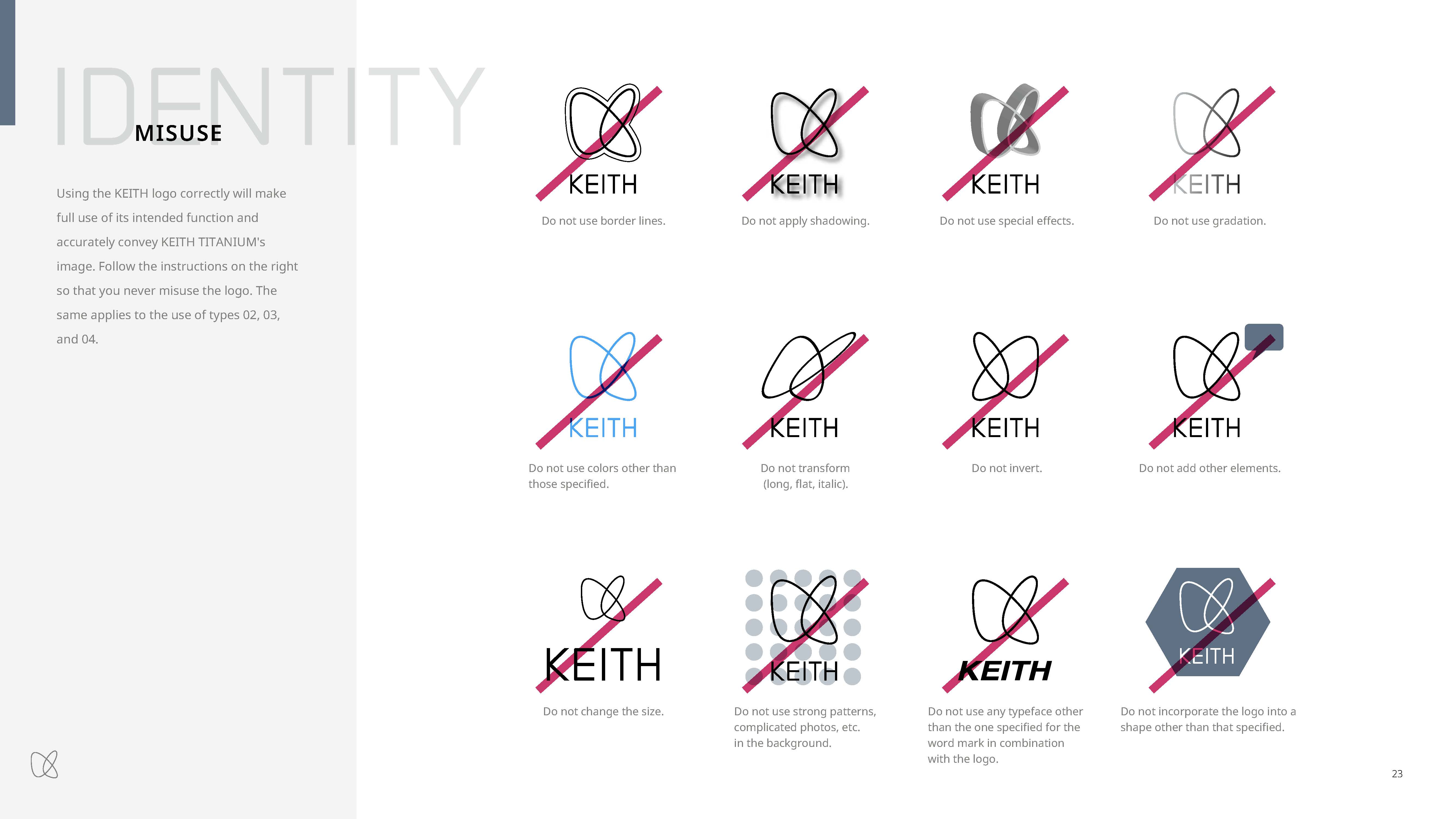
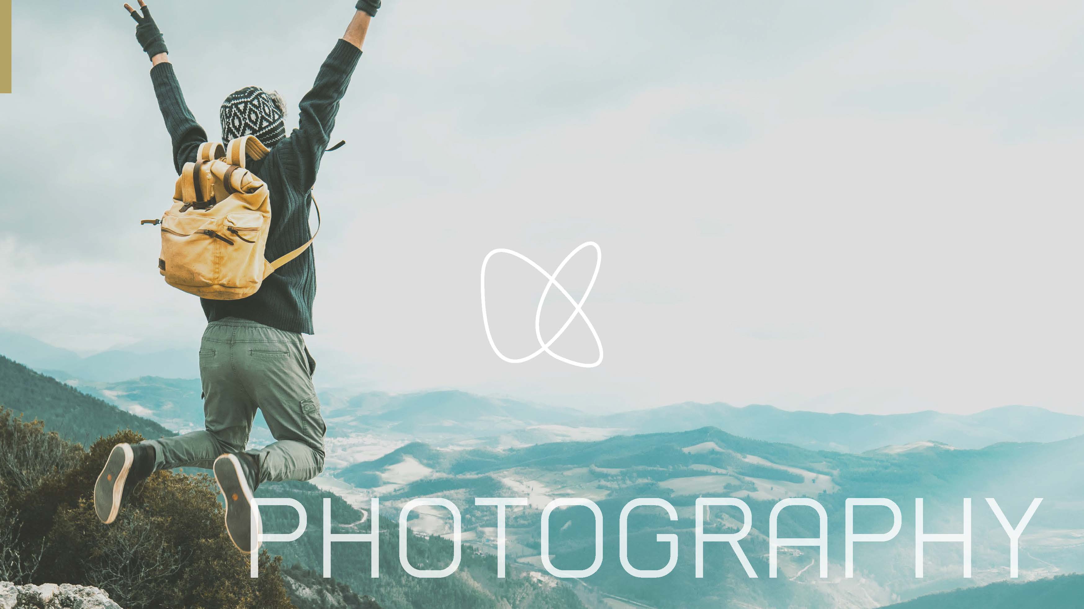
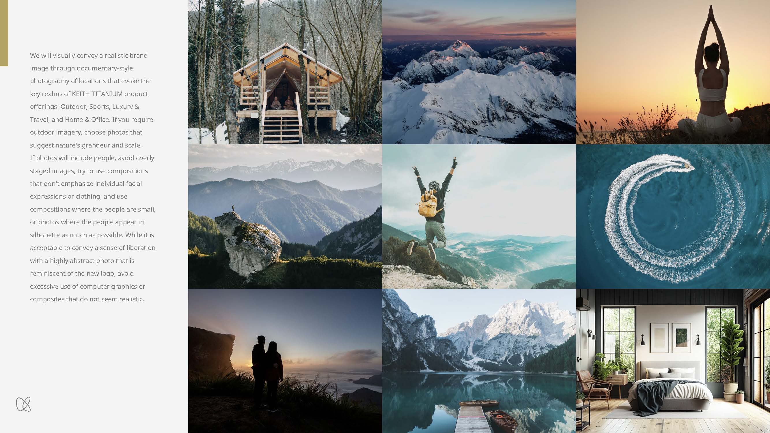
Wecompiled a comprehensive guideline covering logo variations (stacked,horizontal, with tagline, standalone wordmark, and social icons), clear spaceand minimum size requirements, misuse rules, the brand color palette (3primary, 6 secondary, 1 highlight color), photography tone and manner, andtypography usage rules — establishing a practical, implementation-ready systemthat ensures brand consistency across global production teams and vendors.

